The challenge
Setting the availability schedules for buying tickets is one of the most important tasks that museums should do. As part of cm.com's platform rebuild for museums, the availability scheduler had been redesigned. However, when I evaluated the new version, I identified several usability issues that were still creating friction for museum clients. I took on the project to address these problems through analysis, iterative testing, and refinement.
The administration could cause critical conflicts
Museums needed a way to configure their ticket availability: defining when visitors could book, for which dates, and under what conditions. But the existing scheduler had fundamental usability issues that made this process unnecessarily complex.
Sometimes having a couple of exceptions make it hard to follow and understand the schedule.
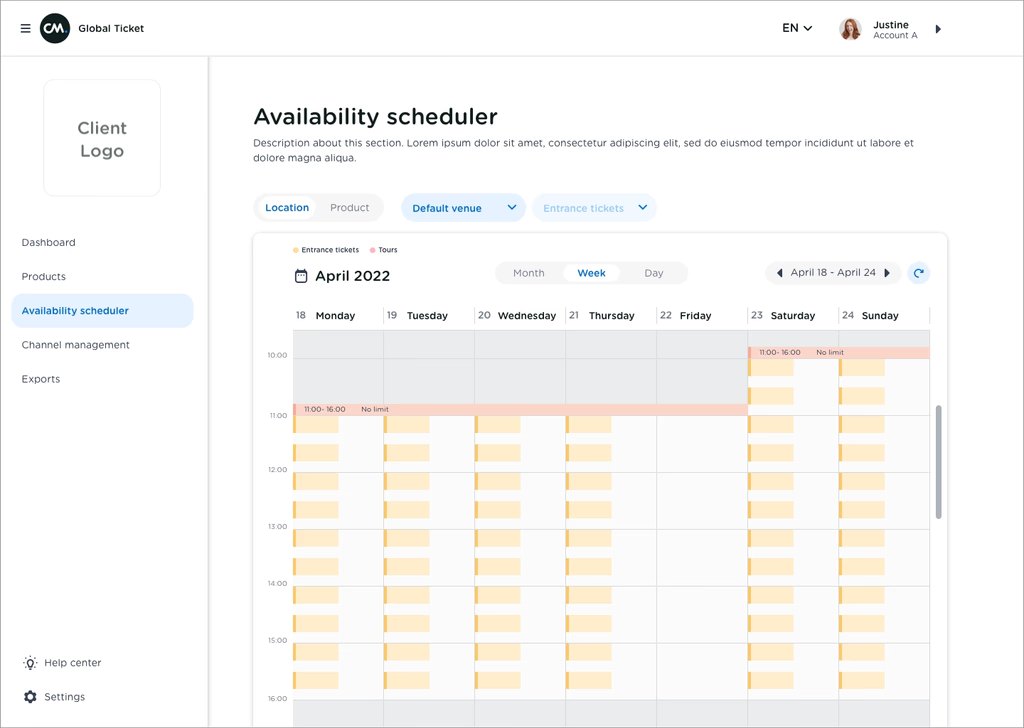
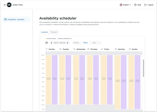
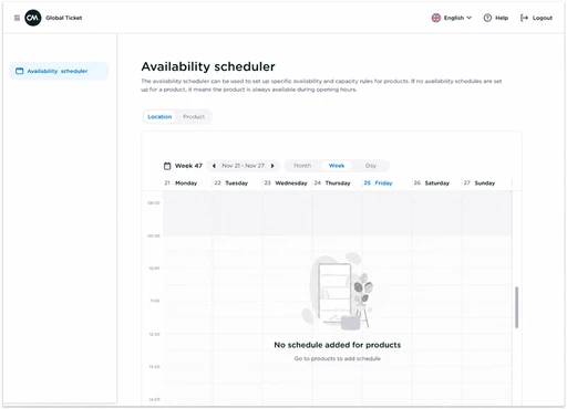
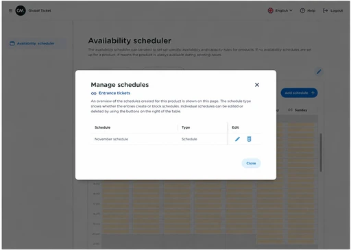
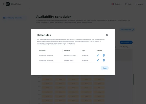
It would help much more if there was an overview of the schedule
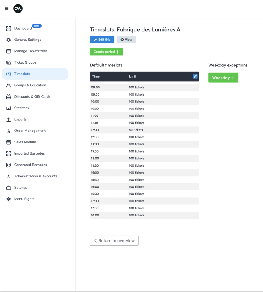
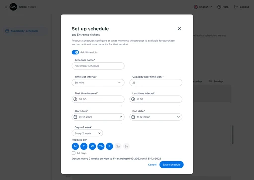
The flow of setting timeslots and assigning it to a ticket group is not intuitive and can cause mistakes resulting in the ticket shop and sales
The toggles in the new design is very confusing
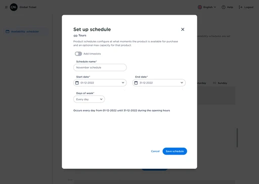
creating timeslots instead of schedules
Adding exceptions to get the ideal schedule is time-consuming and complex
not having an overview of the schedule causes confusion and mistakes
The controllers are not intuitive and clear
Schedules without time slot get mixed-up with the ones with time slot
One Customer Success Manager for a couple of clients
One of the biggest challenges in this project was that each museum had different requirements. Some needed simple weekly schedules, others had seasonal variations, special events, or capacity restrictions that changed constantly.
This meant the solution couldn't be one-size-fits-all — but it also couldn't be so flexible that it became overwhelming.
Before diving into testing, I interviewed customer success managers who worked directly with museum clients. These conversations helped me understand:
- The most common support requests related to the scheduler
- Where museums were getting stuck or frustrated
- Patterns in how different types of museums used (or struggled with) the tool
This gave me a foundation to design more targeted test scenarios and know which areas to focus on during usability sessions.
Research Approach
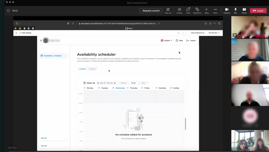
I worked with six museum clients through moderated usability testing sessions. Some were conducted on-site, others remotely. The goal was to test the prototype iteratively, learning from each session and refining the design before the next one.
Participants:
The STRAAT Museum
The Kröller-Müller Museum
The Moco Museum
House of Bols
Verzetsmuseum
Nxt Museum
Iterative Testing & Refinement
Rather than testing a fixed prototype with all six museums, I used an iterative approach:
Test with Museum 1 → Identify issues → Refine prototype
Test with Museum 2 → Validate fixes → Discover new edge cases → Refine
Test with Museum 3 → Continue iteration
And so on...
This approach allowed me to:
Validate that each round of changes actually solved the problems
Catch issues early before they compounded
Build confidence in the solution progressively
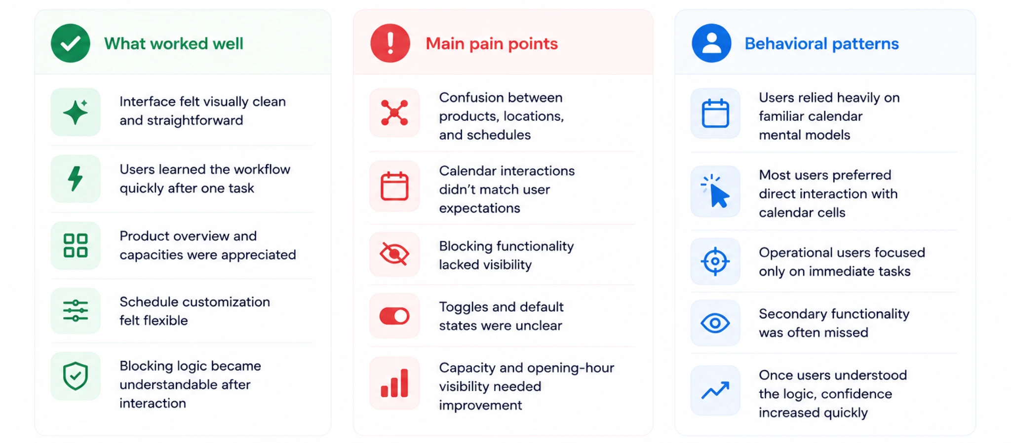
Key results of the usability test and interviews
We not only had the usability sessions with our clients but also alongside the product owner took advantage of these sessions to interview them about their whole experience with the ticketing platform. here are the key insights we gathered.
The Prioritization Challenge
Each museum brought their own requirements to the table. If I had tried to accommodate every single request, the interface would have become bloated and unusable.
Instead, I needed to identify:
Which requirements were most common across museums
Which were critical vs. nice-to-have
Where we could create flexible solutions that served multiple needs
The Framework
I mapped all requirements from the six museums and categorized them by:
Frequency: How many museums needed this?
Criticality: Could they operate without it?
Complexity: How much would it complicate the interface?
Achievements and impacts
Here are a few number of results that we achieved in this project:
Availability configuration were no longer needed to be done by CSMers as it was usable enough for the clients to learn and do by themselves
The overview of the calendar reduced the inevitable mistakes causing problems for operations, sales and visitors
The majority of clients with different requirements could reach their goals and needs
The new availability section was scalable and had the capacity to add even more features for the future


Get in Touch
