Problem statement
Many museums struggle with providing a seamless and efficient ticketing experience for their visitors. CM.com is a platform providing many services including ticketing solutions for museums and parks. However creating webshops for each and every museum is something that takes a huge amount of resources like time and money. Given that we had a webshop with a couple of functional and technical problems, we needed to redesign a modular ticket shop for more than 200 museums in a way that meets their needs/goals.
Objectives
Design a user-friendly web shop for museum visitors to purchase tickets in advance with clear information about ticket options and availability. This should be a modular web shop that can be configured with different colour schemes for different clients.
Design process
We mainly used the double diamond process for the ticket shop redesign which includes these steps:
Discover: Understand the issue rather than merely assuming it.
Define: The insight gathered from the discovery phase can help to define the challenge in a different way.
Develop: Give different answers to the clearly defined problem, seeking inspiration from elsewhere and co-designing with a range of different people.
Deliver: Involves testing out different solutions at small-scale, rejecting those that will not work and improving the ones that will.
User interview
We interviewed some of the stakeholders to understand what and why we are trying to achieve for the business and on what timeframe. We wanted to check their expectations regarding look and feel, functionality, and target audience.
Key takeaways
Main user groups which helped us create our personas
The ideal user flow
New required features such a shopping cart
The order of information appearing on the landing page of the web shop
Personas
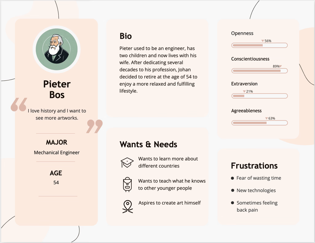
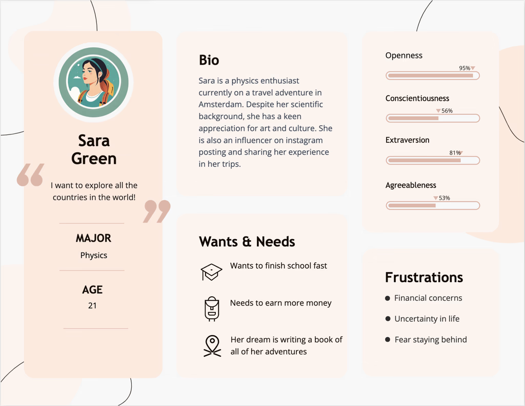
By talking to some of the stakeholders such as the CSM(customer success manager), we defined two main personas who buy tickets for museums in the Netherlands. This helped a lot in understanding the user pain points in every step of their user journey.
Deconstruct existing design
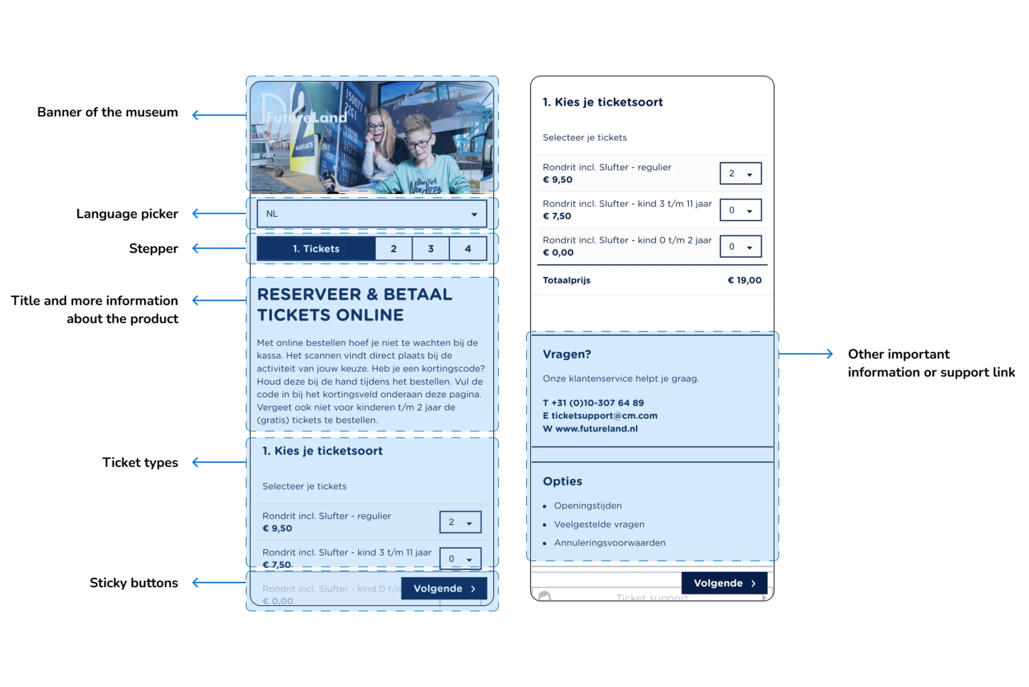
We investigated the current designs that were used by clients which was actually different for each and every of them. However there were some basic components that needed to be there especially for the MVP.
Competitive analysis
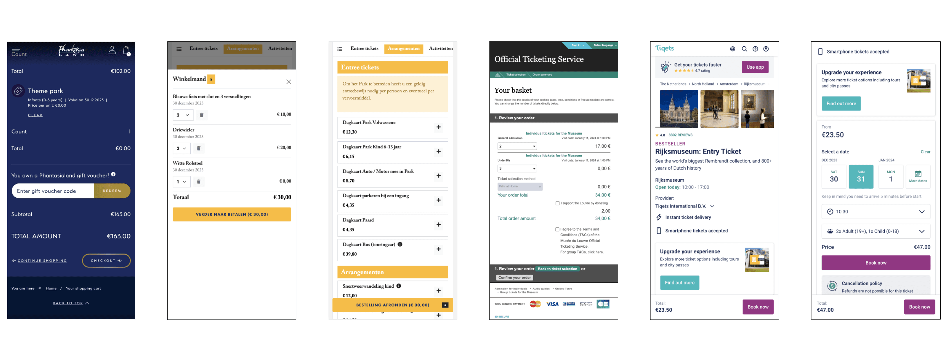
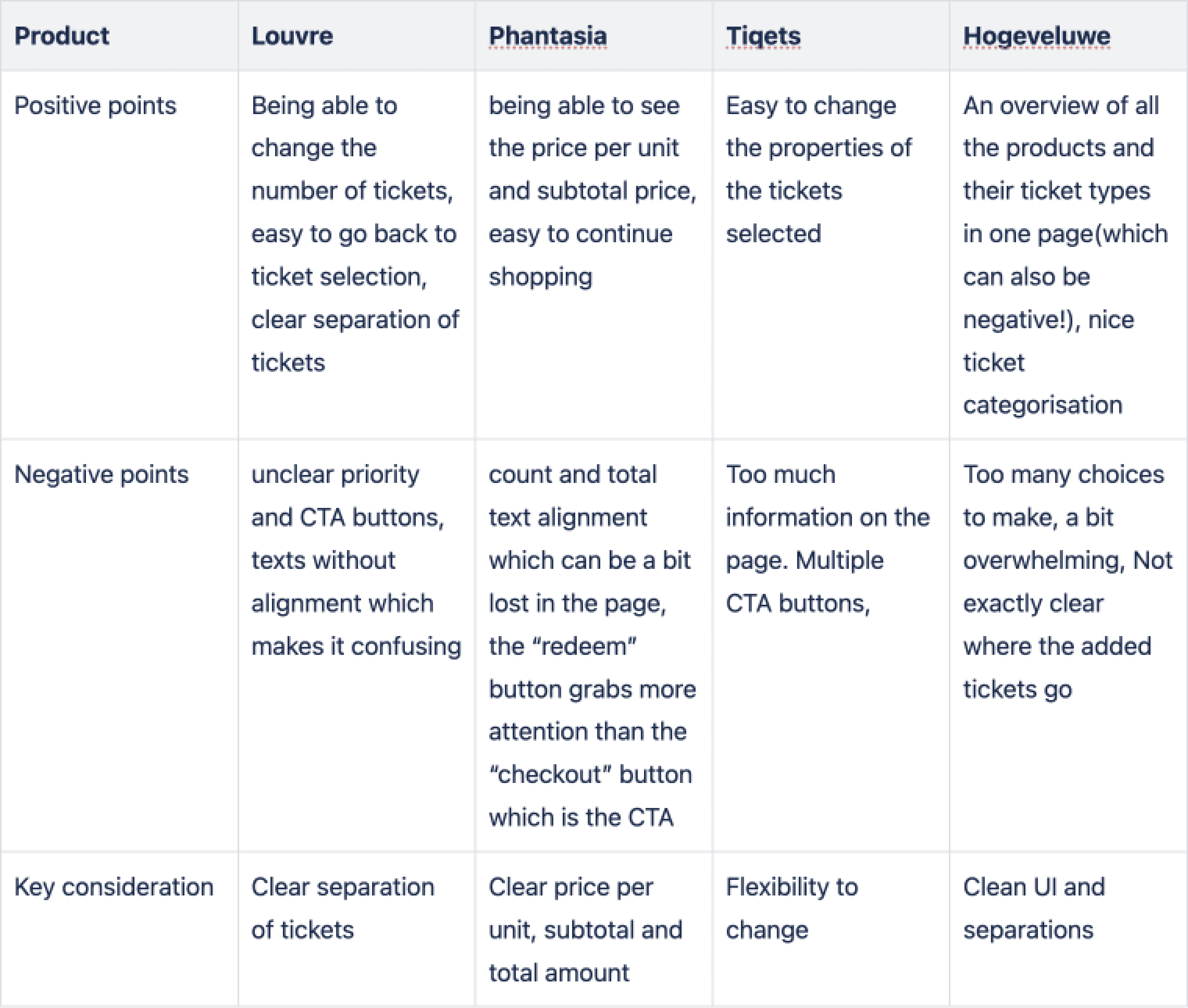
Although the main reason for this project was about scaling and technical issues, we found it essential to look at some of the competitors, especially for some of the features that were new to our platform like the shopping cart. Investigating the best practices were really helpful to improve our designs.
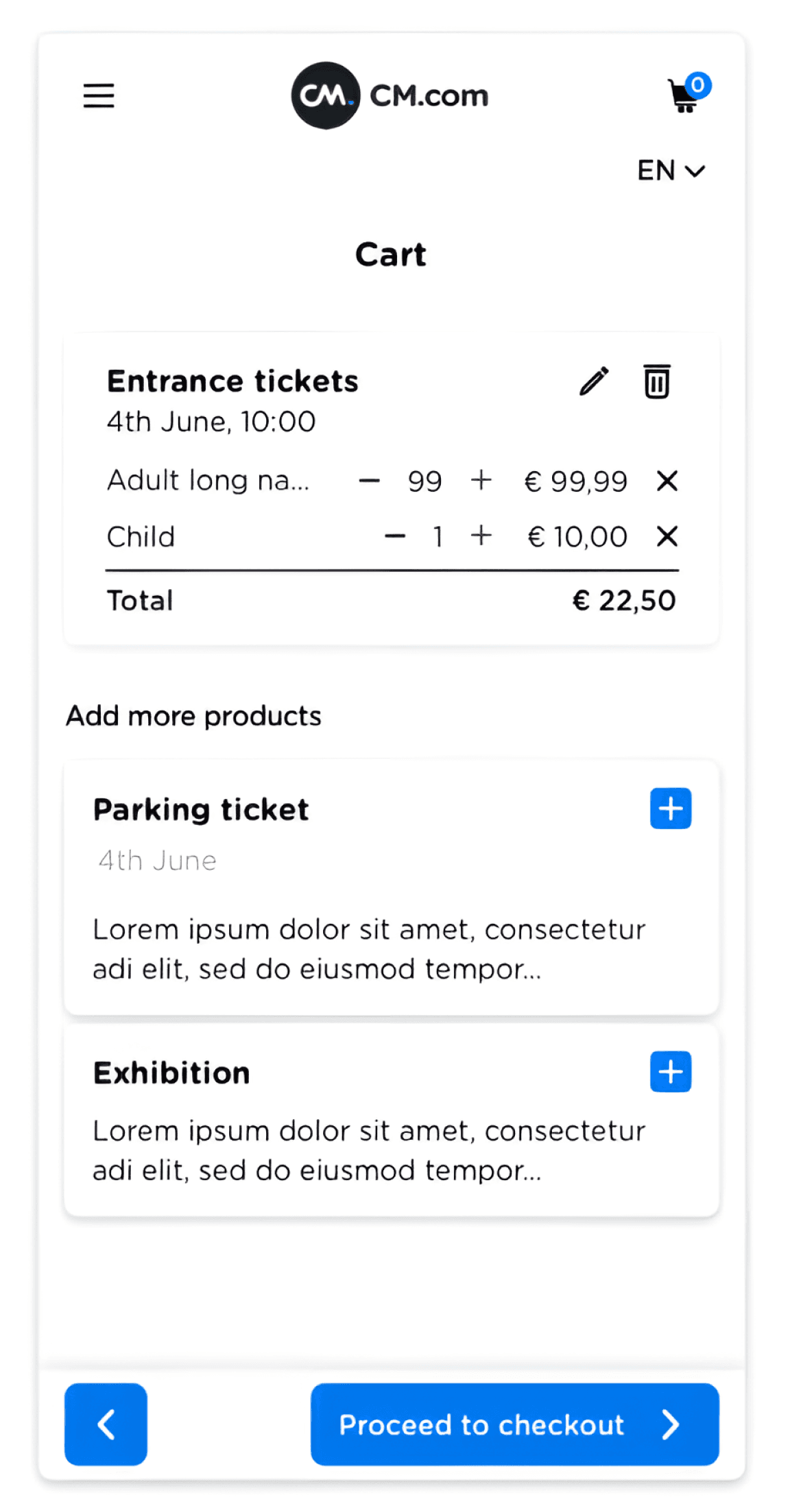
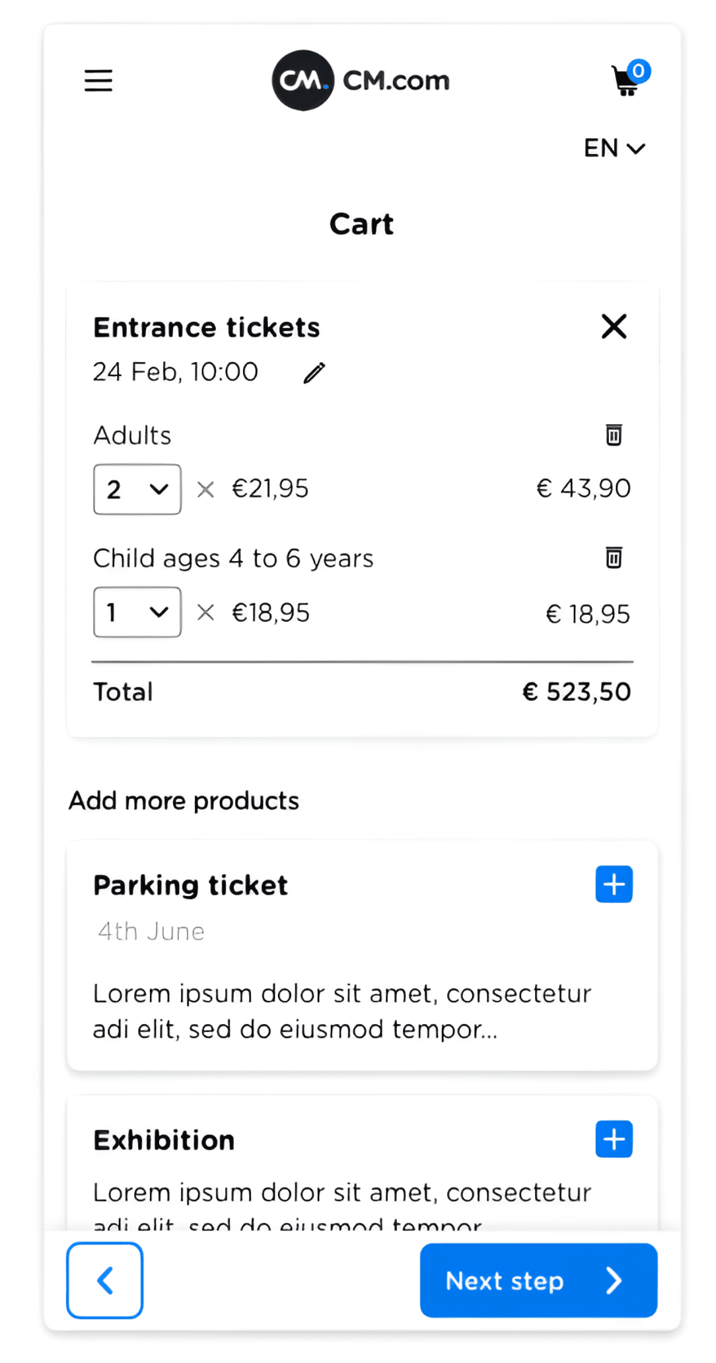
Here is how this research helped to improve the shopping cart design. On the left you can see the first design that we had for the shopping cart which had some UX problems. Through several iteration beside the research mentioned above, I managed to create a significantly better design in terms of both appearance and user experience.
it’s clear which part can be edited
two different actions for removing the whole cart item and deleting a ticket type
Price for each ticket and ability to easily change the quantity
Back button should better be a secondary button and not CTA
First iteration
Last iteration
Exploration and ideation
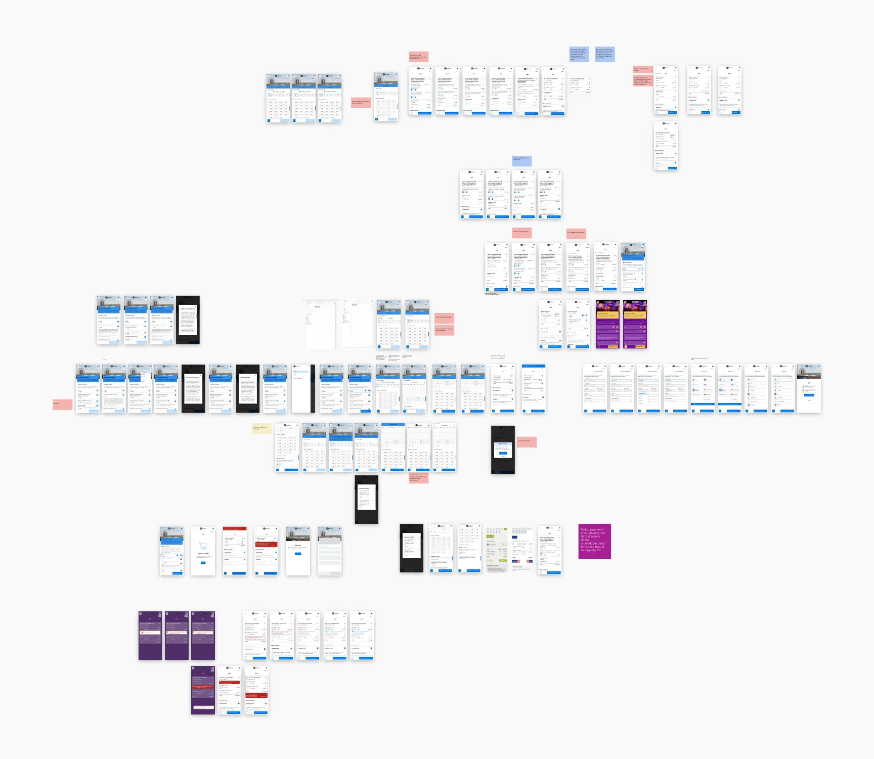
In parallel with the research, we started developing ideas while collaborating with developers to make sure minimal amount of problems would appear in implementation. Based on the current design analysis and data gathered from our research, we had some iterations on ideas for each step of the flow happening in the web shop. It is essential to mention that this is just a part of an overview of several iterations I had beside other investigations and stakeholder feedbacks.
UI challenge
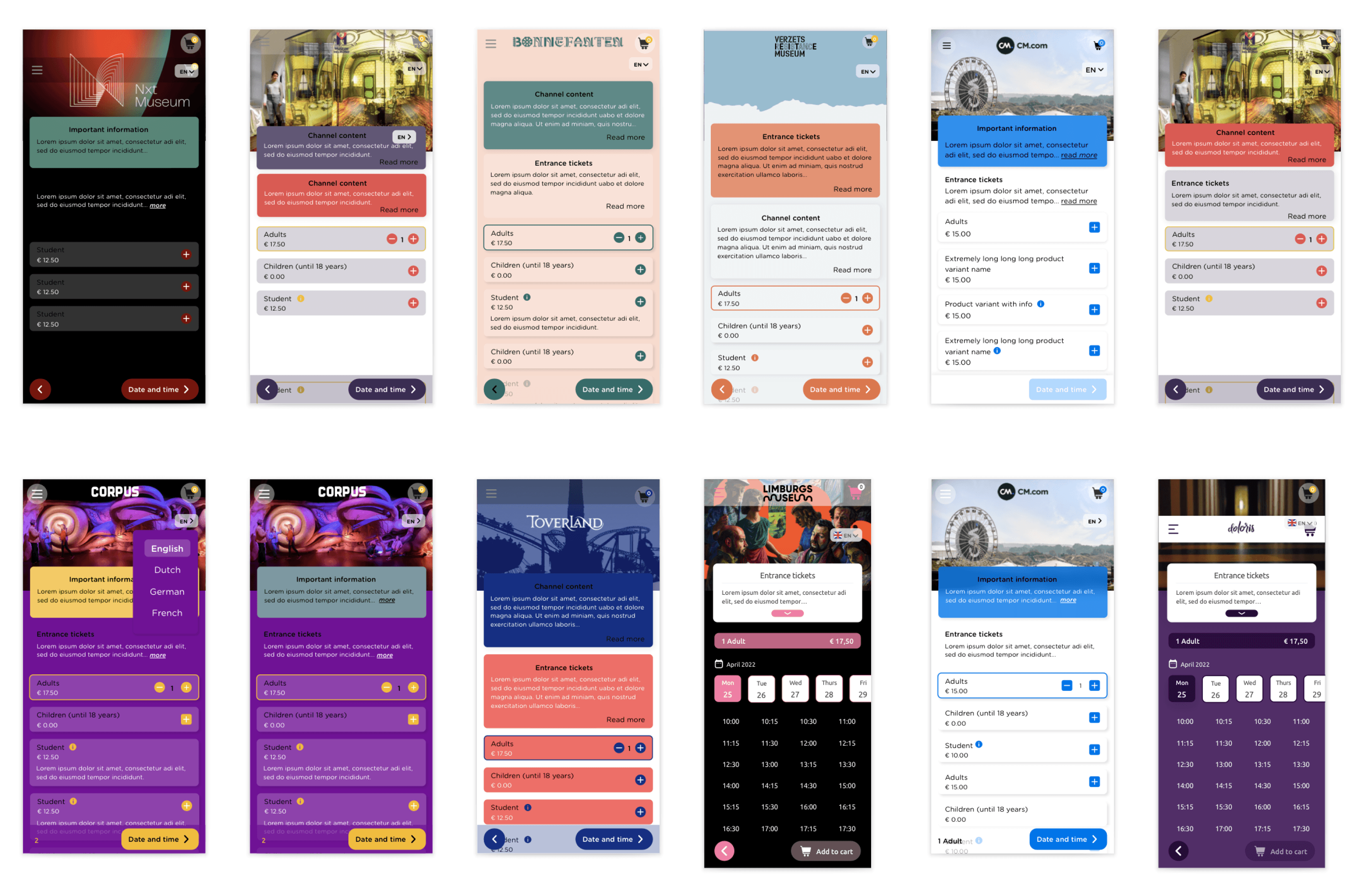
As this product was supposed to be used by a number of clients with different brands and visual identities, we couldn’t choose one single colour scheme. It needed to be configurable for each client to be able to adjust it with their own colour scheme. On the other hand, we were technically a bit limited in the amount of customisable settings we could offer in the MVP version.
After doing some investigations about different clients, we figured out that most of them only use one Primary colour and one background colour with either black or white text colour. That was when we came up with the idea of playing with different shades of two colours that the client would choose and then simply put a white or black text on it according to the contrast checker.
Final design
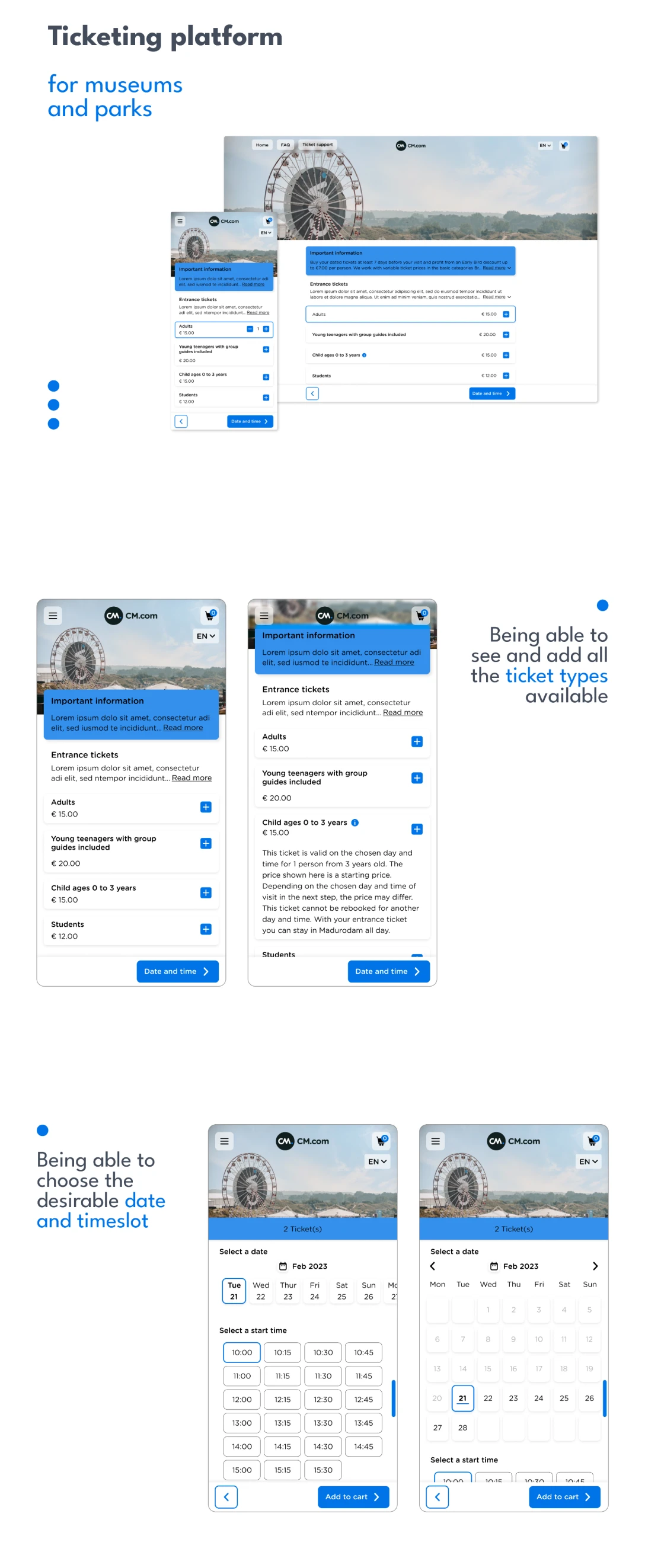
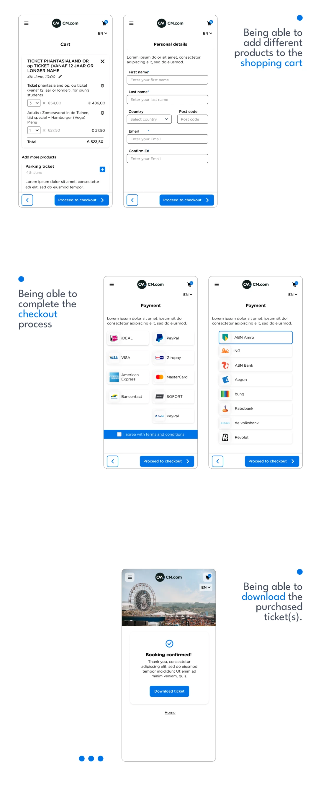
The design process never ends and you can always get feedback, test and continue iterating. However, according to the resources such as time you should decide at some point to test the product and publish it! Here are the final designs after all the collaborations in which we tried to consider the user-centric design, accessibility, responsiveness and business requirements.
Get in Touch
